BRAND + PRODUCT + WEBSITE
2023 / 2024
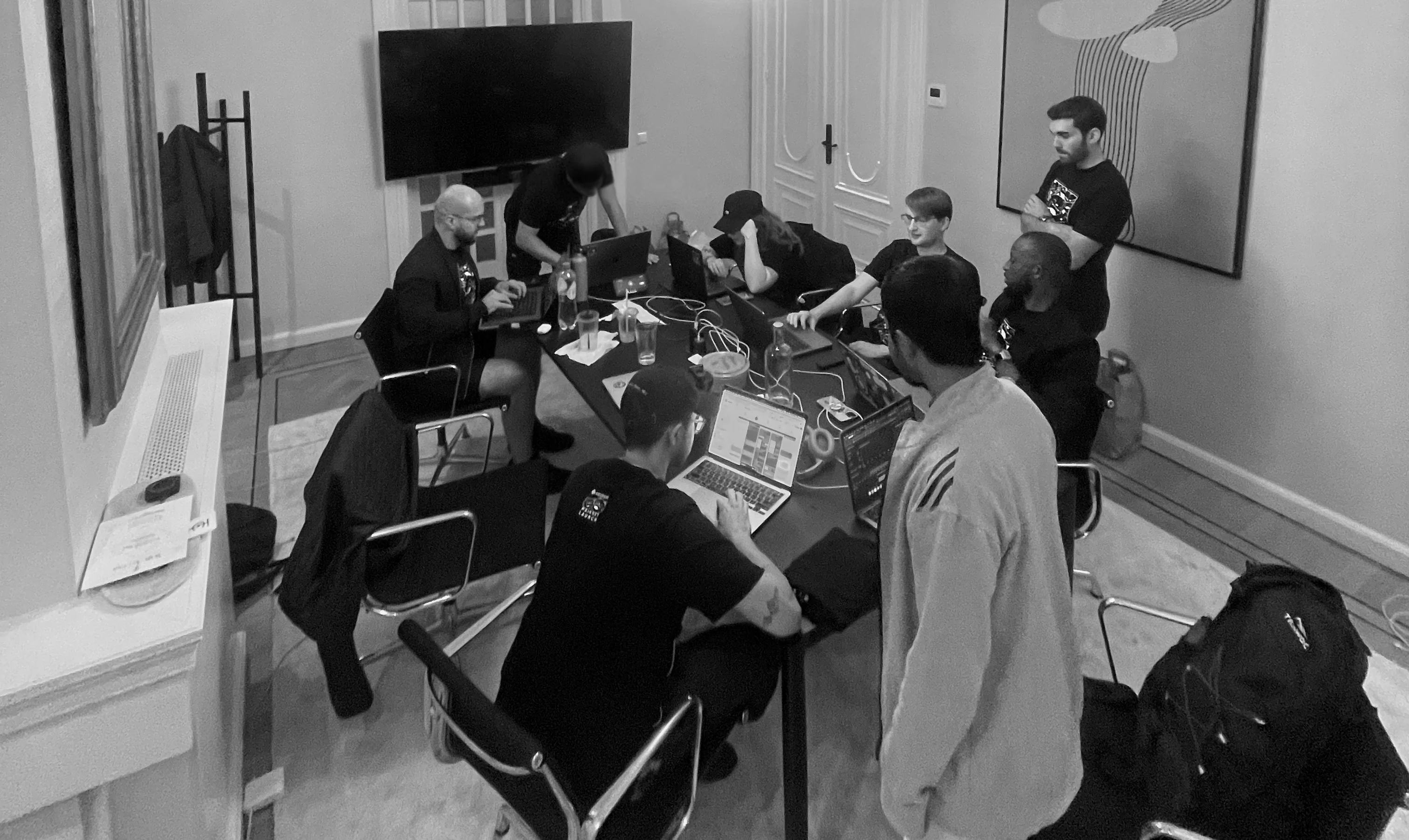
Catalyst team in Amsterdam
$4.2M
13 months
$5M
$20M
Catalyst was a permissionless interoperability protocol focused on solving cross-chain liquidity fragmentation in an increasingly modular blockchain ecosystem.
The app ran on testnet for several months before going into production, which gave the community and the team time to test and validate the UX before deploying on mainnet.
I was the sole designer, working across brand and product, directly with the PM, founder and a dev team spread across eight countries.
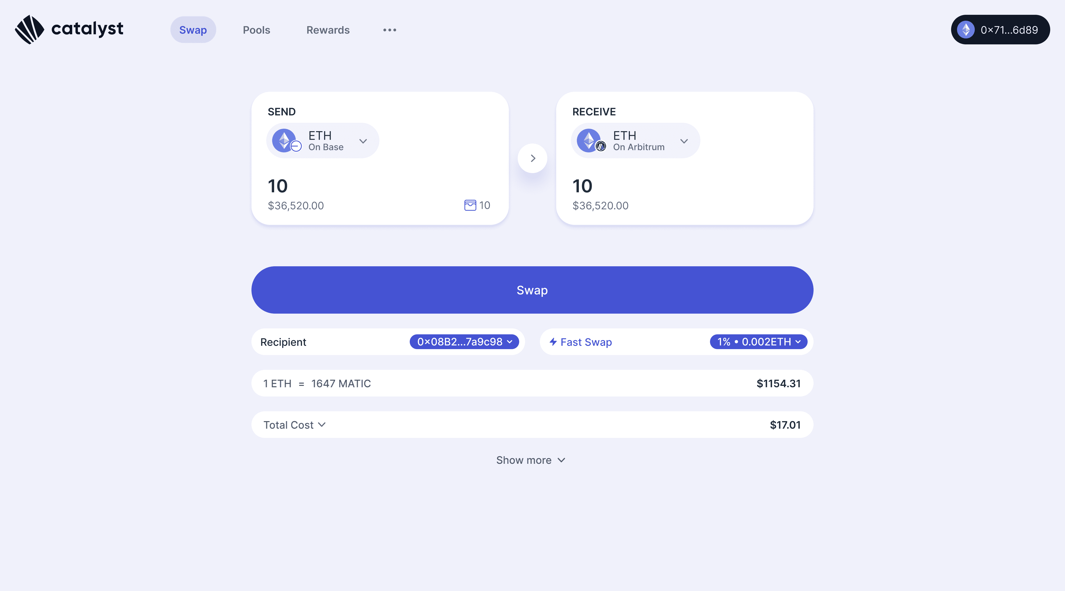
Catalyst Swap Interface
The deposit problem
Each Catalyst pool held tokens across multiple chains in weight ratios defined at creation. For example, a pool might hold 50% ETH on Base, 25% on Arbitrum and 25% on Optimism. Those ratios kept prices stable. Shift the balance and you'd move the price.
The first deposit flow enforced the ratio strictly. The problem:
Most LPs didn't hold all required tokens across all chains
Users had to manually solve the ratio before depositing anything
Displaying user's deposit in comparison with the correct token ratio wasn't super clear
UI had to be scalable to show up to 9 tokens
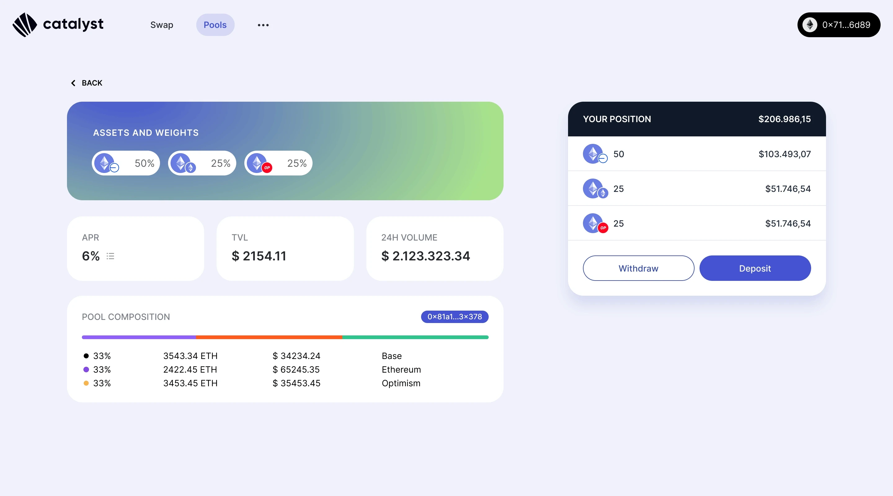
Pool page details showing assets and weights, stats and pool composition on the left. On the right, user position and CTAs to deposit or withdraw.
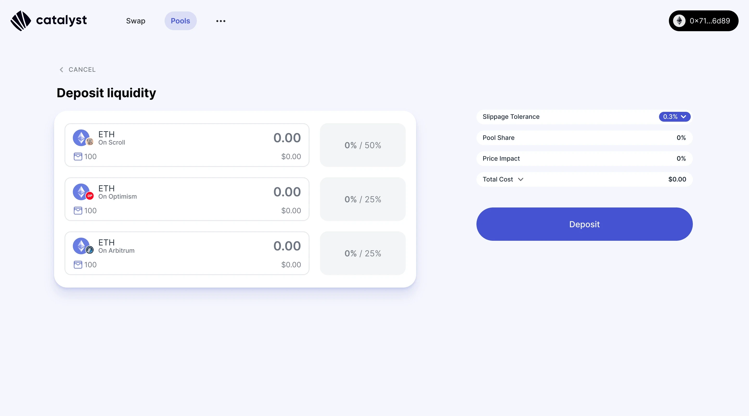
The first deposit flow. Correct ratios required before proceeding.
The solution: Liquidity Swaps
Deposit at least one token from the pool, any amount, and Catalyst would swap and split it into the correct ratios automatically across chains.
To make that work without confusion, we redesigned the deposit flow:
Two deposit modes: Balanced Deposit for LPs who want manual control, Single Token for anyone who wants Catalyst to handle the rebalancing
Locked ratio inputs: fill in one token amount and the UI auto-fills the others respecting the correct ratio. No manual maths required
A live final position panel on the right, showing the exact token distribution before committing
Added visual representations for Liquidity Swaps with complete flow inside modal
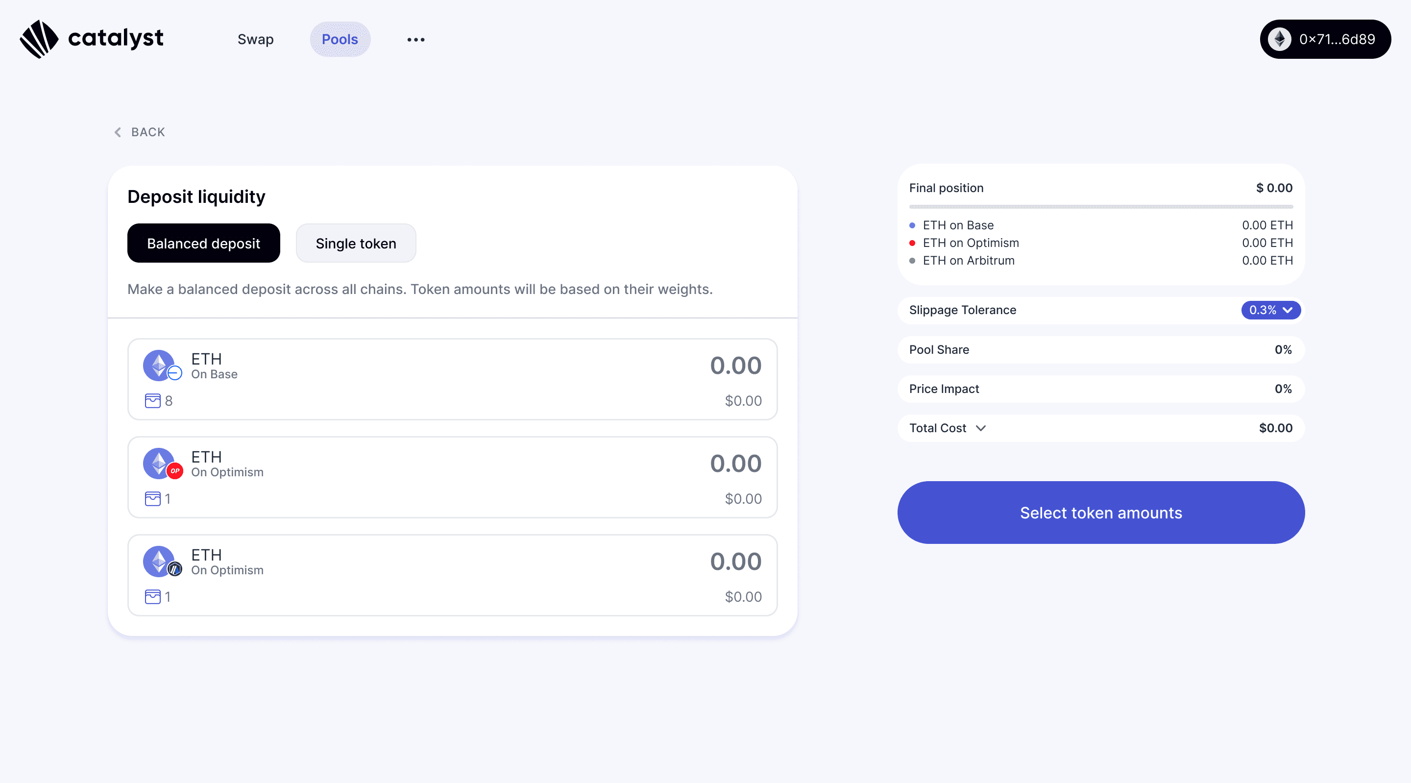
Balanced Deposit UI
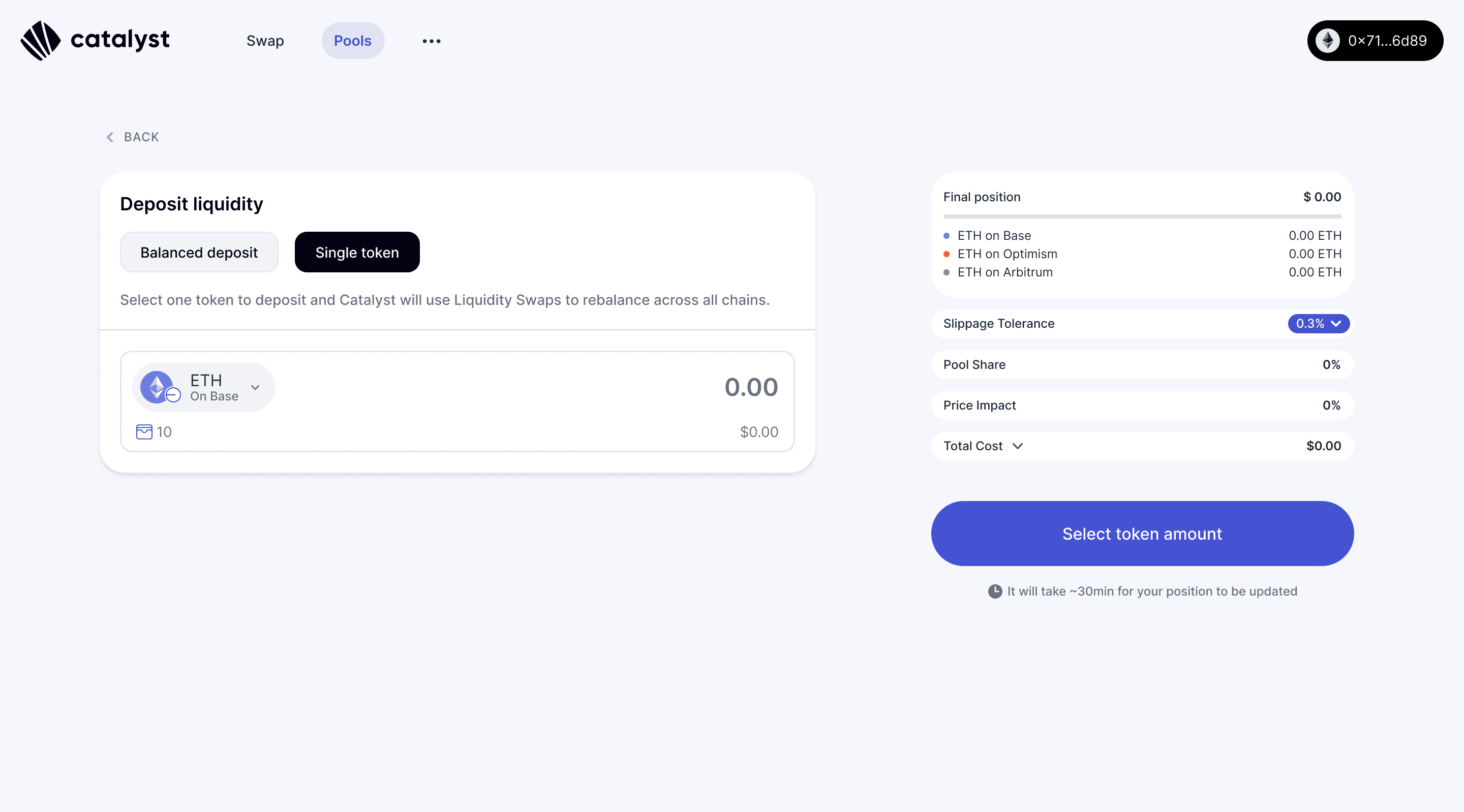
Single Token Deposit UI
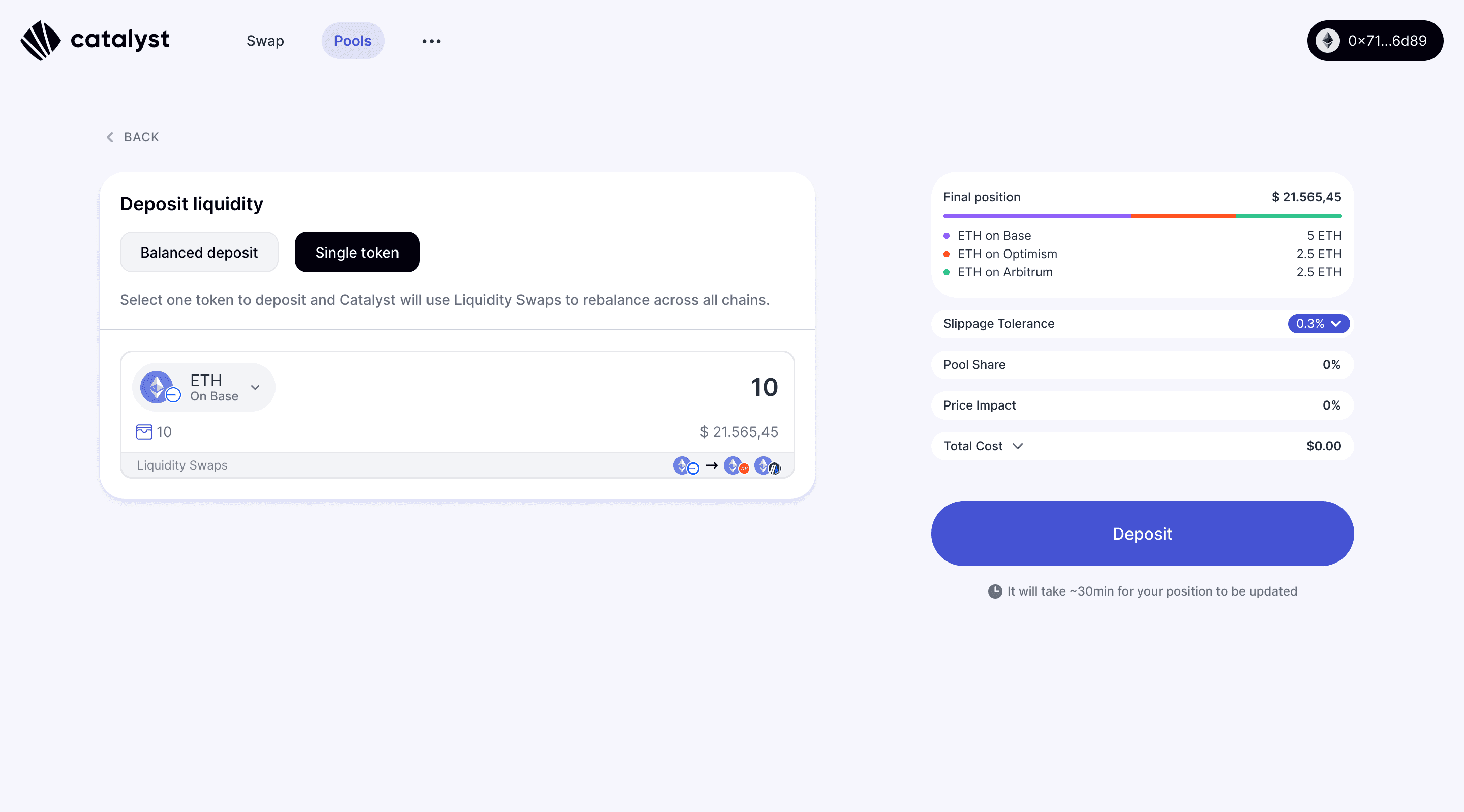
Single Token Deposit UI showing final token distribution and liquidity swaps

Liquidity Swap Modal showing what happens under the hood
The approval flow
Technical constraints that emerged during build multiplied the approval steps. Nobody fully anticipated how many there would be.
Depositing across three chains required:
Approving token access per token
Approving the deposit per chain
Switching networks in between
Six or more sequential wallet interactions per deposit. You can't remove them. The protocol requires them. The design question was: how do you make six wallet interactions feel like a process someone can follow and trust?

Deposit Approval Flow showing all steps user will need to complete
The answer was to give users the full map before they started:
A checklist of every step, visible upfront
Each step named plainly: Approve access to your ETH tokens. Switch to Arbitrum. Approve ETH deposit.
Deposit approval highlights the active token while giving context of pending deposits
Wallet popup shown in context so users could see what they were signing and why.
The progress panel tracked on-chain transactions in parallel, with timestamps and block explorer links. Users could see chain activity while approvals were still running.

Each deposit step highlights the active token.

Active deposits stack on top while the flow continues

Deposits in progress

Full deposit completed
Pool creation
The first pool creation form showed everything at once. The form wasn't that long, but opening it felt like it was.
Early investors and liquidity providers who tested the prototype flagged two things:
No way to visualise what the pool would look like before creating it
Filling in fields with no sense of what was being built

First version of Create Pool UI

Create Pool new version with collapsed steps
The redesign addressed both:
Collapsible step-by-step structure, each section collapsed once completed
Recommended options are pre-selected by default
Live composition panel on the right, updating in real time
Colour-coded bar showing token weights across chains as you configured them
The form didn't get shorter. It got clearer about where you were in it, and what you were creating.

Each deposit step highlights the active token.
Designing for errors
Given the number of approval steps required, many things can go wrong mid-flow. Connection drops, accidental rejections, timeouts. The principle across all scenarios was the same: never make users start over.
The harder case was a partial deposit. User completed some chains but not all, then something interrupted. We used two alert states, persistent across the app, to reflect the urgency of each situation:
Blue when no deposit has been made yet. No panic. Users can cancel the pool creation or resume where they left off
Red when a deposit is already in progress. Funds are on the move. The alert demands attention and offers two clear exits: Withdraw funds or Resume deposit

Alert for when pool creation is abandoned before the deposit step.
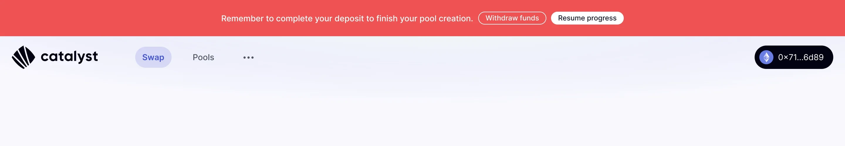
Alert reminding users to complete the deposit to activate the pool.

Alert for when a deposit is interrupted mid-flow across chains.


What we shipped
A full product, built from zero over 13 months:
Cross-chain swap
Liquidity deposit and withdrawal
Pool creation
Partial deposit recovery and resume
Referral dashboard
Airdrop Claim UI
Marketing landing page
Brand design
Catalyst raised a $4.2M seed round. Peak TVL hit $5M. Total volume reached $20M.
Dropdown showing transactions in progress
User menu
Swap approval flow
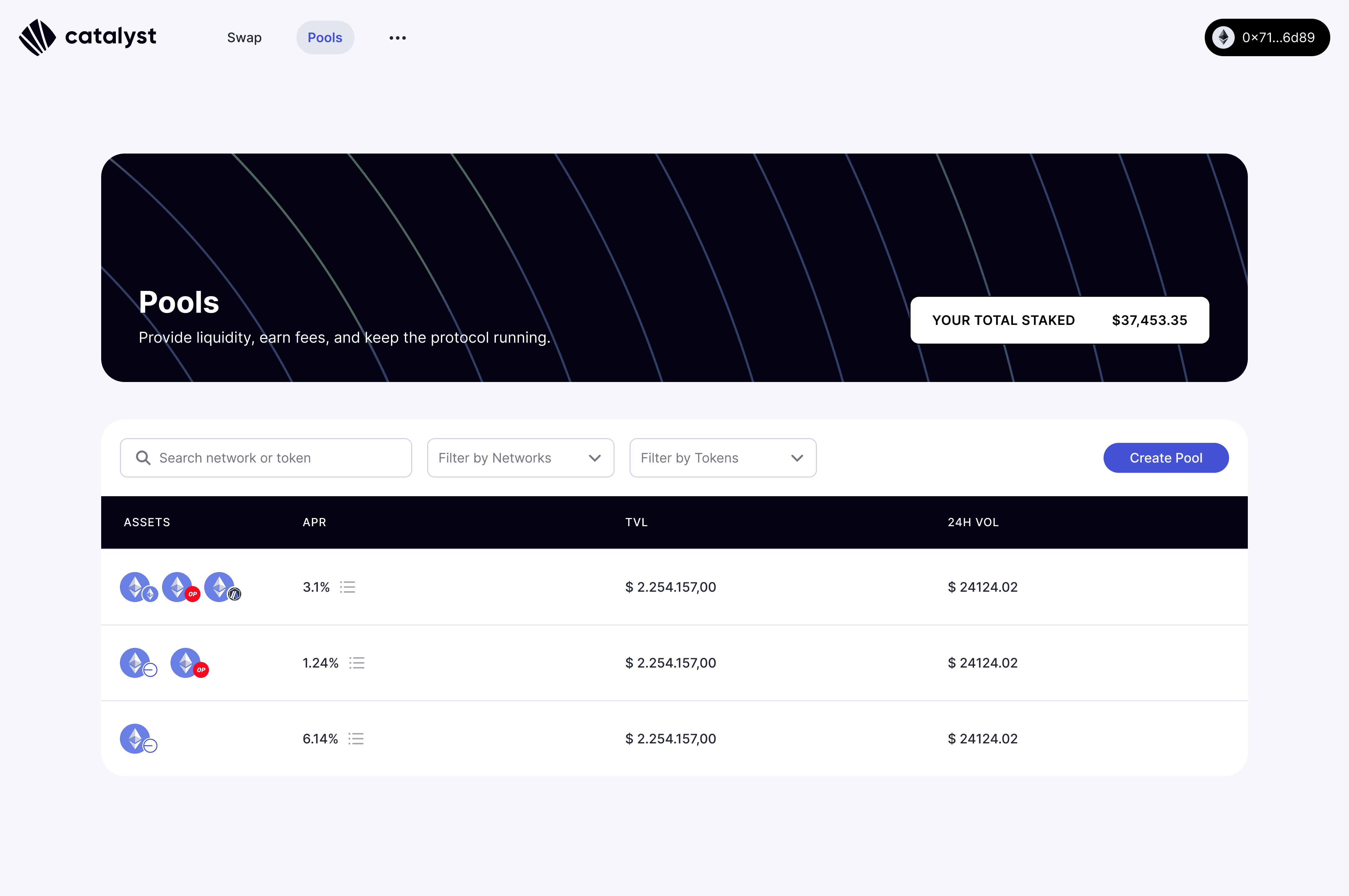
Pools page

Mobile and Dark Mode designs
View next project